

Design Principles For Mobile App Development
Learn from the best: Mobile Design Principles
7 rules to follow for better mobile user experience.
![]()
My experience with designing for mobile
I've been designing for mobile platforms for years, including web and native, for smartphones and tablets. In my role as Design Team Lead at SimpleSite, I've recently had the opportunity to work on a new version of our browser-based DIY website builder for mobile devices.
Although we didn't design for mobile-first in a chronological sense, we approached the project in that way. We combined our learnings from desktop, our existing and new knowledge about our mobile users, and the universal mobile design principles applied in the best apps and websites out there.
I think t hese principles are often so implicitly understood that they're forgotten or ignored. This article is my attempt at giving them the attention they deserve, with some concrete examples to learn from.
The principles apply whether you're designing for the web or a native app, so I hope you'll go through them and make sure you're putting them into practice.
Principle #1: Strive for minimalism
I would never tell anyone to not strive for minimalism. It's just even more important when the space is limited. Fitting all the necessary UI elements onto a smartphone screen without cluttering the interface and overwhelming your users can be tricky.
You need to be ruthless when prioritizing the UI elements to put on each screen. It's so easy to fall into the trap of packing too much information into an interface, only to end up overwhelming your users in an attempt to give them everything they could potentially want.
"Perfection is achieved not when there is nothing more to add, but when there is nothing left to take away."
— Antoine de Saint-Exupéry
Get a deep understanding of your mobile users' needs. What are their very most important tasks to complete? What are the essential information and functionalities you need to provide for them to do so?
As a simple rule of thumb, strive for one primary action per screen. This is where solutions like filters, sensible defaults, clever options for sorting, an easily accessible search feature, and progressive disclosure come in handy.
Once you've prioritized as much as possible, you can reach an even more minimalistic design by increasing white space, using a simple, elegant font, and other visual design best practices.
A minimalist design will improve both the visual experience and the speed of your website or app. And speed is part of the experience. The longer it takes to load a page or some content, the worse the experience.
Prioritize speed alongside all the features, content, and visual bells and whistles you could potentially add. You — and your users — can't have it all.
Learn from Instapaper
The Instapaper app is a great example to learn from. Instapaper allows people to easily save articles for later reading, and the home screen of the app is clearly designed around this purpose. It shows a list of the user's saved articles — and not much else!
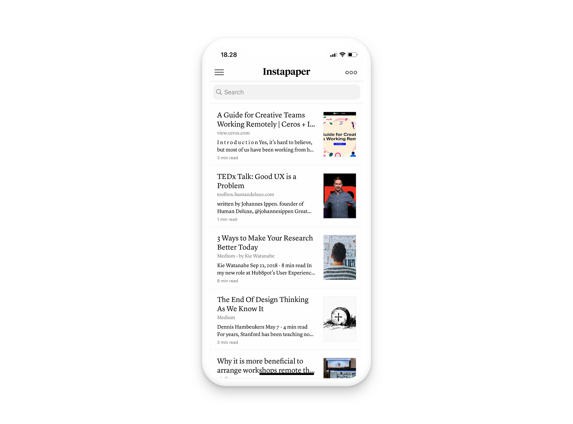
Specifically, the user has a search bar above their list of articles, and a menu in each top corner. The app doesn't even feature the very common footer menu. Furthermore, the app is kept in a clean, monochrome design.
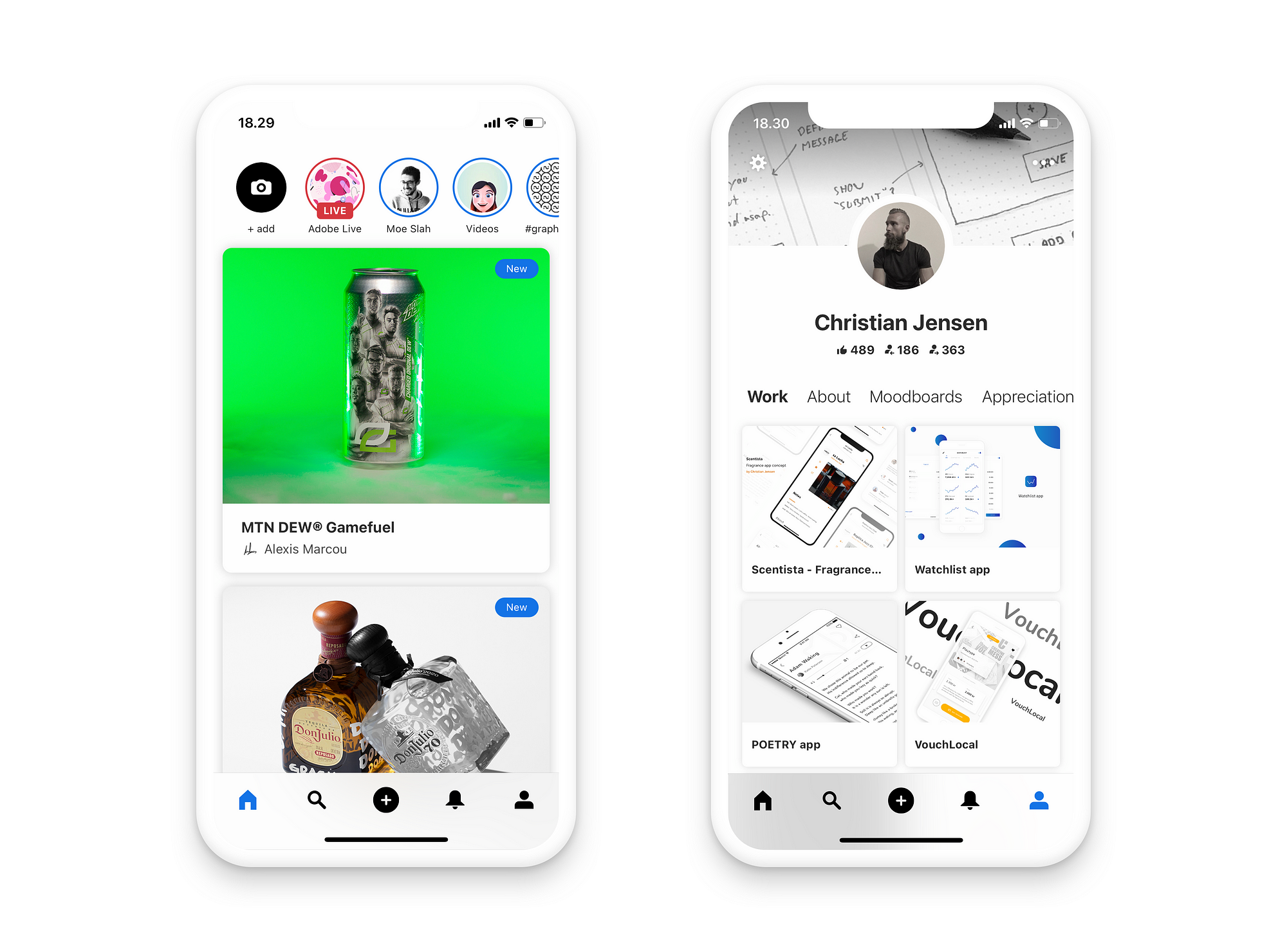
Learn from Behance
Behance is another beautifully minimalistic app to learn from. The design uses a generous amount of white space, and each screen has a clear focus.
Principle #2: Place your most important elements near the bottom or center
Steven Hoober has done a lot of interesting research on the topic of mobile user behavior and best practices. His studies show the importance of placing the most important UI controls within reach of your user's thumb when the phone is held in one hand, although he's also proven that users hold their phones in many different ways.
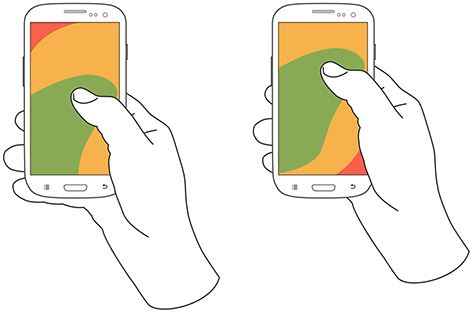
Furthermore, he's showed that mobile users, when given the choice, prefer their content to be vertically centered on the screen. This seems to be the case for both reading and interacting with content.
"I set up a study that let users move the content to the position on the screen where they naturally wanted it to be. Once they had moved the content to the center of the screen, they would tap to select it." — Steven Hoober
Consider centering (some of) your most important content on the screen, whenever it makes sense, but don't go out of your way to turn your footer menu into centered icons and buttons.
When given the choice, mobile users prefer the center of the screen for both reading and interacting with content.
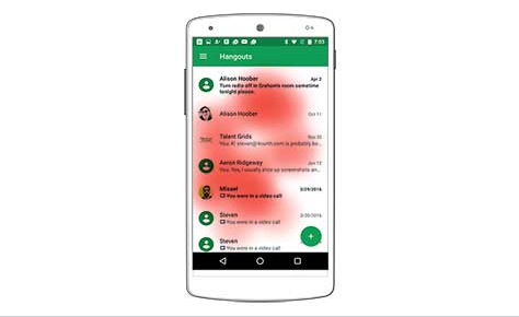
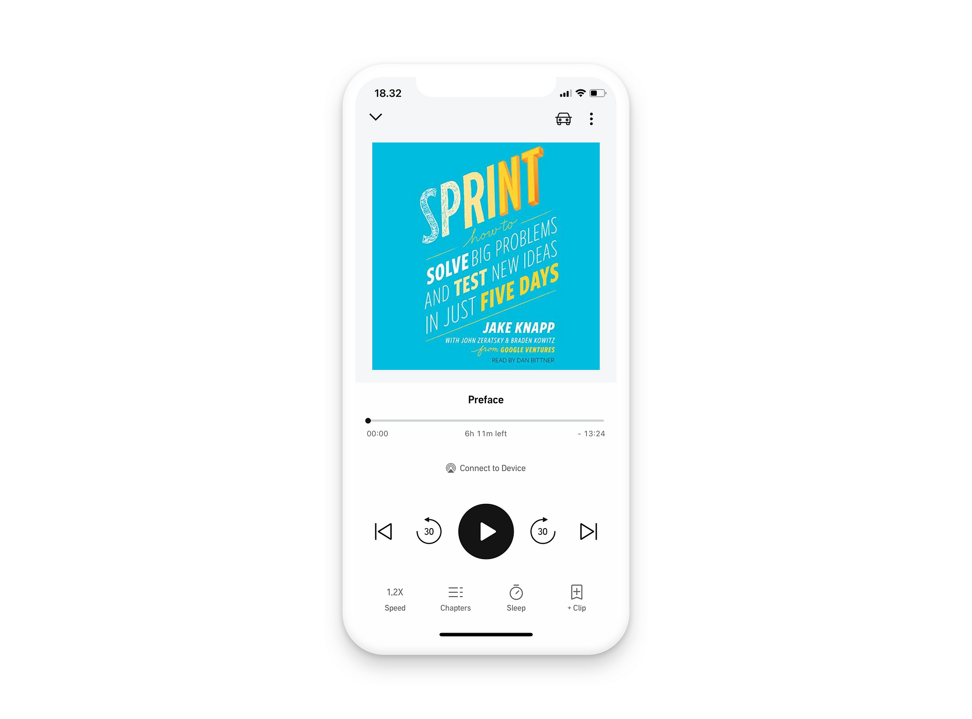
Learn from Audible
Footer menus are extremely common in all kinds of different apps, and for good reason. Aside from all these, audio players provide a good example of the main controls being positioned in the bottom half of the screen. Think podcast apps, music players, and audiobook apps. Audible is a well-known example of the latter.
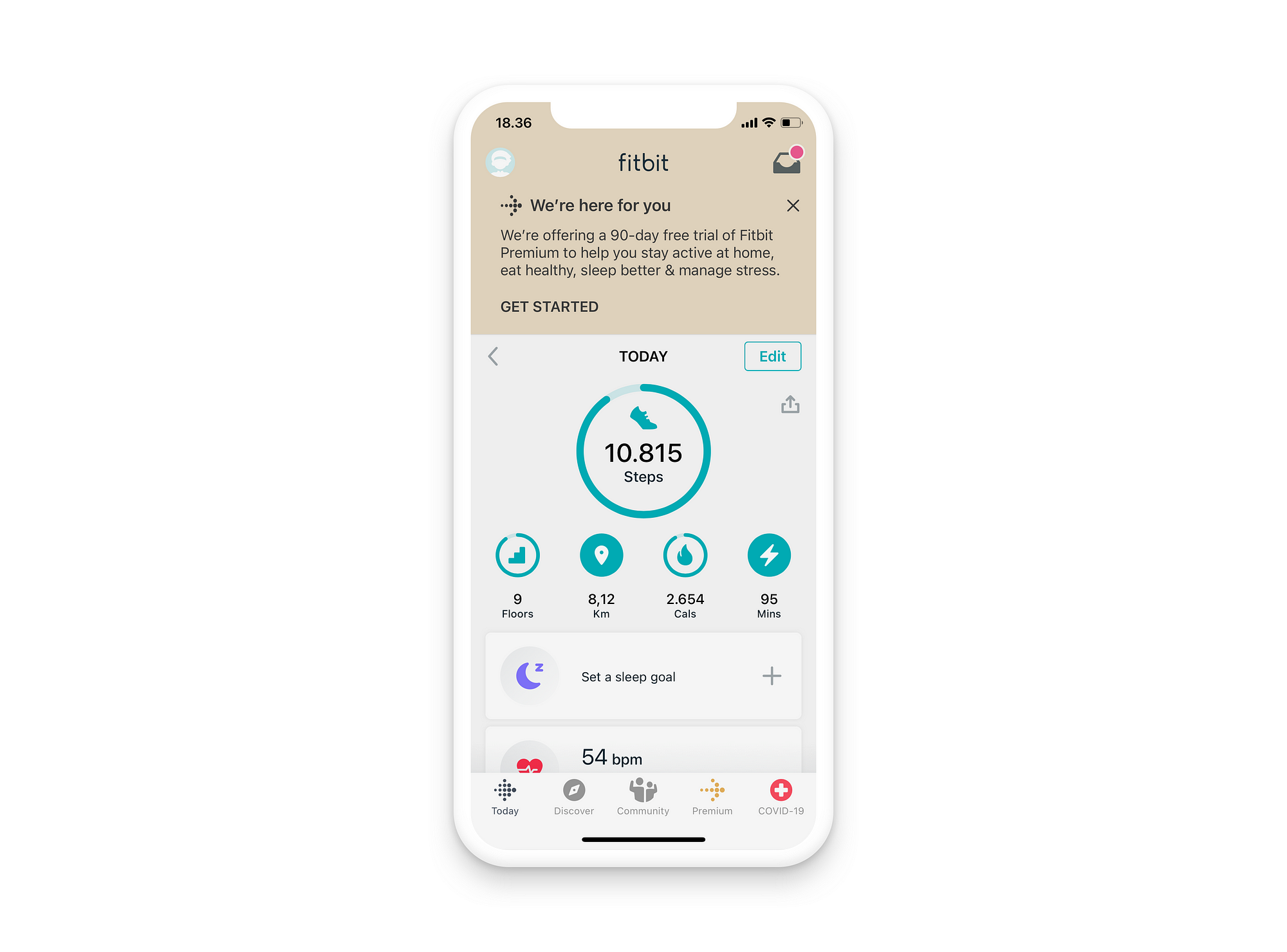
Learn from Fitbit
The primary function of the Fitbit app is arguably to provide information to its user. This information is centered on the main screen of the app, easily accessible to the user.
Principle #3: Reduce the need for typing
While an amazing invention in many ways, there's no way around the fact that using a touchscreen keyboard for longer-form typing sucks. The keys are small by necessity. Feedback is poor compared to the mechanical movement of a laptop or external keyboard.
Furthermore, your mobile users, compared to those on laptop or desktop devices, will often have less time to interact with your design. They might be on the go or looking for a 1-minute distraction while waiting in line.
Certain accessories can bring the benefits of a laptop or desktop device to a mobile one. If your user uses an external keyboard, a mouse, and/or a stylus for their tablet, they're closer to your laptop and desktop users in this regard. This is probably not the case for more than a fraction of your users though.
Basically, your mobile users have neither the desire nor the time to type a lot of text when using your website or product. Design accordingly:
- Auto-fill any input field that can be auto-filled.
- Make smart suggestions when a user starts typing or entering a search term.
- Let users pick categories or filter their options in other ways.
- Use date pickers instead of requiring your user to write a date.
These are just a few, obvious examples. You'll discover many more of them as soon as you make a habit of asking yourself: Could this task be solved with less typing from the user?
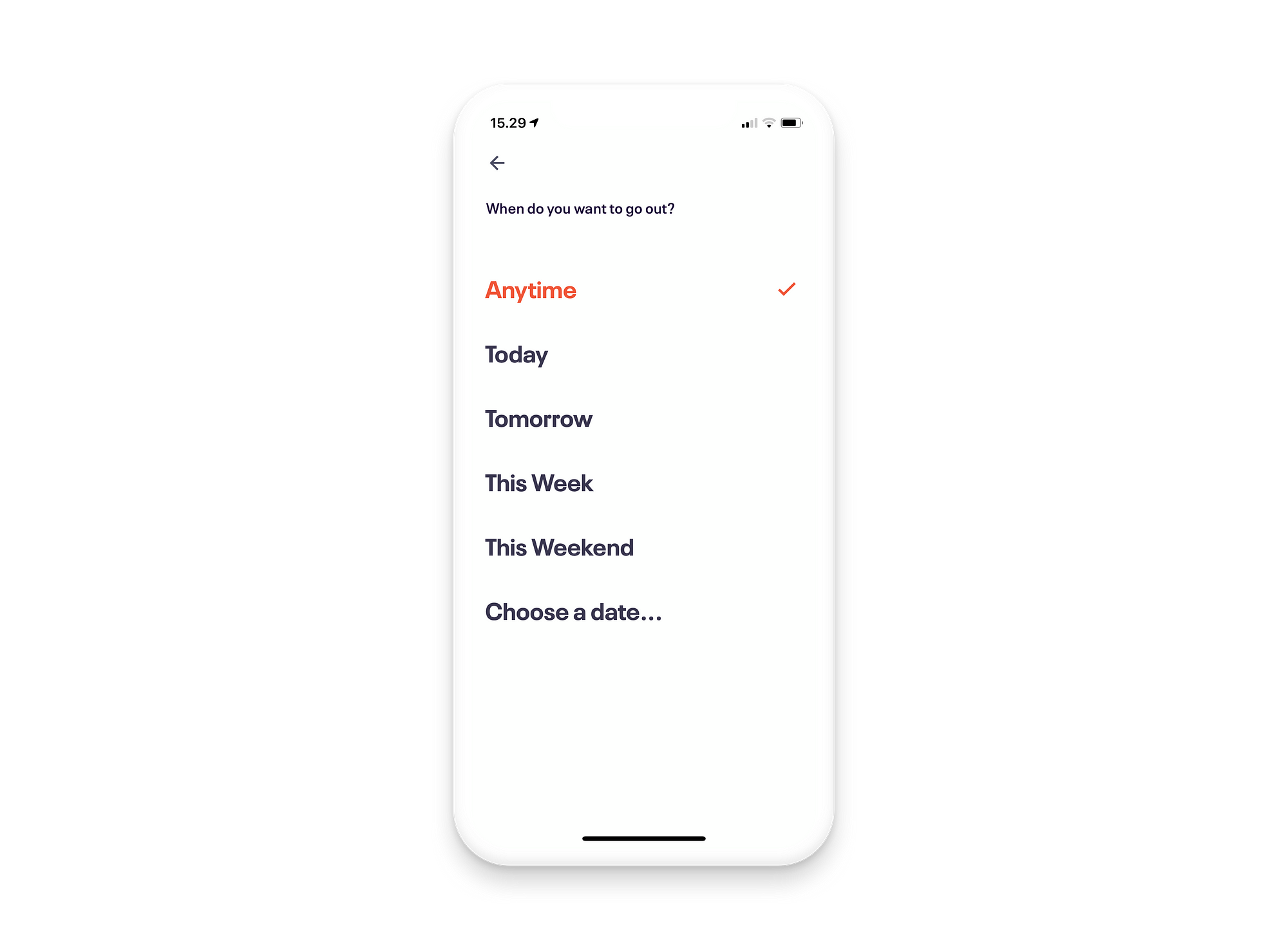
Learn from Eventbrite
The search functionality in Eventbrite's app is worth learning from. Particularly when searching for events based on time, the regular date-picker is actually the last option on a list of smart defaults: "Anytime", "Today", "Tomorrow", "This Week", and "This Weekend".
Principle #4: Increase the size of your tap targets
The cursor on a laptop or desktop computer enables users to hit even the smallest target on the screen. Hitting a target on a touchscreen is a lot more difficult.
Not only is the tip of your finger much larger and less accurate than the cursor of a mouse, but it will be covering your target as you try to tap it.
The size of a tap target will ideally depend on its placement on the screen, in accordance with principle number 2. However, you'll never go wrong with designing for the largest possible tap targets.
Follow the guidelines provided by Apple and Android, who recommend tap targets of at least 44 x 44 points and 48 x 48 dp (device-independent pixels) respectively.
The most obvious way to achieve this is to increase the size of your UI controls. Additionally, try adding some extra whitespace around your elements to not only reduce the risk of mis-taps, but also create a more minimalist interface.
Whitespace will also enable you to make each tap target larger than the control itself. This can be applied to all UI controls on the screen but is particularly important for the small ones that can't easily be made bigger.
You may not want to significantly increase the size of your tappable icons in the footer menu, or use a 32 pts font size for your text links. Instead, simply increase the size of the invisible tap target area around the element itself (or tell your Developer colleague to do so). Make it as large as possible without interfering with other UI elements.
If you follow the advice above, you're designing for error prevention instead of error handling. However, you'll never be able to completely eliminate mis-taps. With that in mind, make sure nothing catastrophic happens when a target is missed. You might want to reconsider that one-click "delete all" button right next to the CtA…
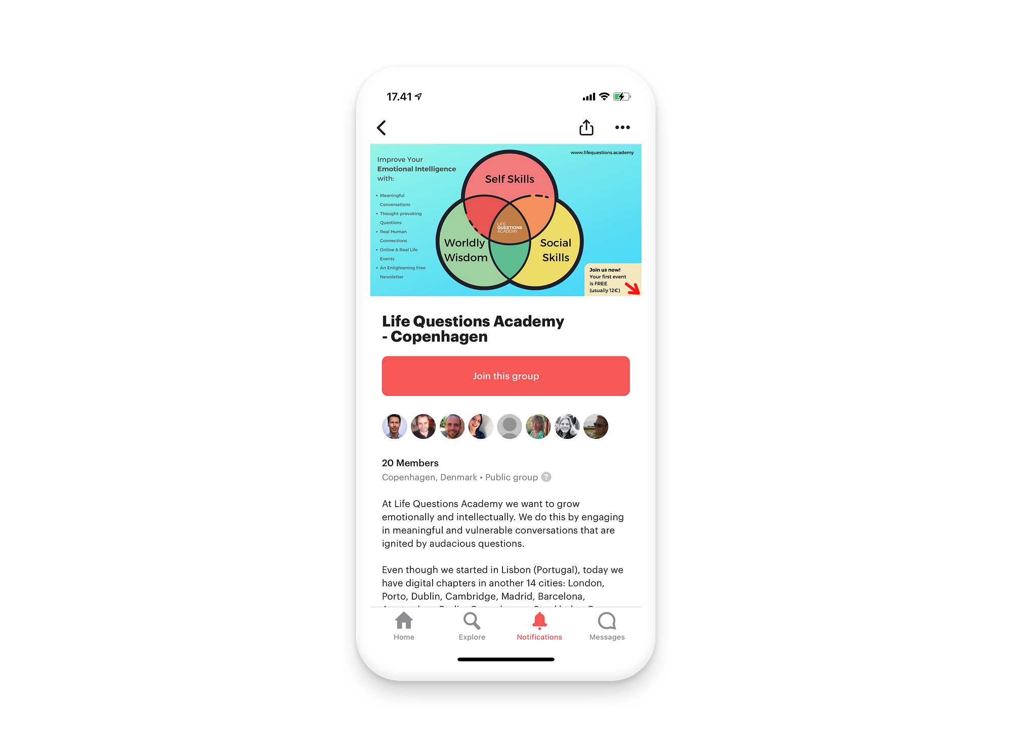
Learn from Meetup
The Meetup app is one of many good examples to learn from. When looking at a Meetup group, there's a big, prominent button in the center of the screen, easily reached and tapped by the user.
Principle #5: Prioritize legibility
Legibility is another one of those things that's obviously important regardless of the platform your designing for. You should always follow the common guidelines for font sizing, line height, font choices for longer-form texts, etc.
The most important of these recommendations to know for mobile is the 16pt font size. Use any smaller than that and you'll start compromising legibility for at least some of your users.
The more interesting mobile-specific challenge, though, is the fact that your website or app will likely be used outside. It will be used on the go, on busy streets, and with the sun either hitting the screen or your user's eyes. Not really the "ideal conditions" from a usability perspective.
Look, I love a thin #9A9A9A font on a white background just as much as the next guy, and it sure gets a ton of likes and rebounds on Dribbble. But, if you're aiming for great UX — and not just in a perfectly lit room — you need to prioritize legibility above your own aesthetic preferences.
Learn from Medium.com
Many native apps support dynamic type sizing, adjusting to the user's settings. This changes your responsibility as a Product Designer, from designing with the perfect font size to making sure your app supports dynamic type.
For a website to learn from, check out Medium.com. If any site should be optimized for readability, I guess it should be this one.
Principle #6: Give immediate — and good(!) — feedback
With 5G right around the corner, designing for poor mobile internet connections may soon be much less of a concern. Until then though, don't expect your mobile users to have stable, high-speed internet connections, and don't neglect your loading states.
Any of your mobile users will likely have to wait for something to load, at one point or another, especially if they're on a cellular connection. "Wait" is a relative term, and we rarely measure it in milliseconds. But we do in UX.
Your users will notice if the delay is above 300 ms, and likely start to mentally context-switch if it gets above 1.000 ms. If you can't load what a user tapped within that time, you need to at least show them that you're working on it.
Learn from Duolingo
Giving some feedback is definitely better than no feedback at all. Some do it better than others though. Take a look at Duolingo. They make use of the loading time to provide an interesting fact accompanied by a fun animation of their mascot. It's useful and engaging.

Principle #7: Enable easy error recovery
No matter how well you follow the principles above, no matter how great a Designer you are, user errors are bound to happen.
Mis-taps and misunderstandings are your responsibility, but you'll never be able to eliminate them completely.
Furthermore, there's always a risk of errors occurring outside of your and your user's control. Some of these — like a page failing to load due to a poor connection — are more likely on mobile devices.
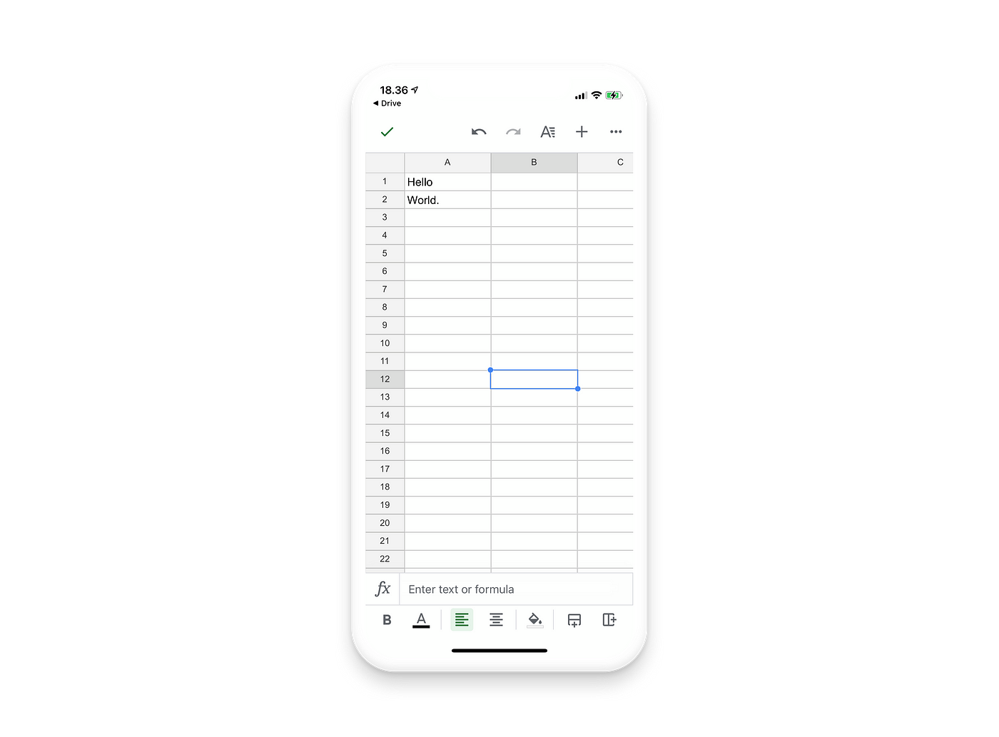
Learn from Google Sheets
Tools like Microsoft's Word, Excel, and PowerPoint, and Google's equivalents, are perhaps what comes to mind when you think of the "undo" feature. Notice that it's one of just a handful of controls prioritized to always be accessible in the top menu bar in the Google Sheets app.
Learn from Airmail
Apps with lists of various kinds let their users perform certain actions by swiping left or right on a list item. Email clients, including Airmail of which I'm personally a user, do this.
An action performed on the list of emails in Airmail is determined by the direction and length of the swipe and is executed instantaneously. This is great for power users who are able to speed up their workflows. Speaking from experience, it's also prone to errors.
The "Undo move to bin" button comes in handy when "delete" is one of the actions when swiping to the left. A similar undo button is shown on other actions as well, including when an email has been sent. It's also common to see in other apps where something can be deleted, archived, or checked off a list. Asana is a great example of the latter.
Key takeaways
The fundamental, universal UX best-practices apply across devices and screen sizes. Some are even more important on mobile though, due to the small screens, the touch-interaction, the context in which they're used, and generally poorer internet connections. A few principles are uniquely suited for mobile devices.
First of all, strive for minimalism in your design, even more so than on desktops and laptops. Center the most important elements in the interface to make them easily accessible to your users, and minimize the required text input.
Increase the size of your tap targets to help your users accomplish their goals faster and more seamlessly, and prioritize legibility to account for the small screens and strong lighting experienced by users using your website or app outside.
Give immediate and good feedback on any action performed by the user. You might need a second to load the requested content or page, and your users will quickly get impatient and wonder if something's wrong.
Finally, when all else fails, at least make sure you enable easy error recovery. Errors are impossible to avoid, and they may or may not be in your and your user's control. Help your users get back on track fast, or risk losing them altogether.
Design Principles For Mobile App Development
Source: https://uxdesign.cc/learn-from-the-best-mobile-design-principles-f1bdc46bc016
Posted by: allisonlaving1985.blogspot.com
0 Response to "Design Principles For Mobile App Development"
Post a Comment